|
POINT A
CORPORATE IDENTITY |
The goal for this project was to create a visual identity, philosophy, creative strategy and design strategy for a fictional graphic design company. My two teammates and I chose to create a company called Point A that specialized in branding identity design.
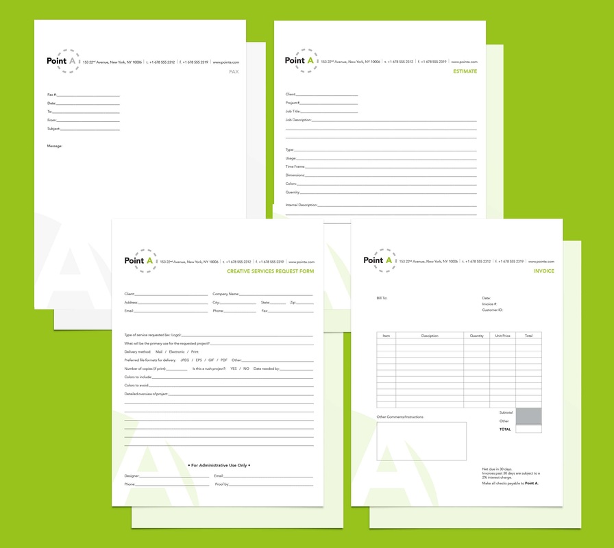
We chose the name Point A as a reference to the beginning of a company, and the fresh new identity that we, as a branding design firm, would provide for our clients. The identity would be the starting point for their company's visual representation in the world. The green and white color palette is also intended to portray this same sense of fresh and new design. The logo design for Point A is simple and easy to identify. We chose the track mark circle to represent the seamless, smooth way that a branding identity should work. The A from the logo is built in to other elements of the company's identity. The business forms as well as the letterhead are all designed on an identical template, to unify these different deliverables. |